Be it a blog post schedule or maintaining a website, we can all agree to the fact that accomplishing various tasks becomes easier when you have a checklist handy and this holds true even for landing pages.
When it comes to creating a killer landing page design for your various marketing campaigns, a landing page checklist comprising of all the essential elements can help you create an optimised landing page that generates more leads and boosts conversion.
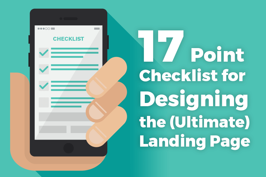
Thus, with this aim in mind, here is a 17 Point landing page checklist that includes all the best practices and nitty-gritty of designing the ultimate landing page for your business.
Take a look!
A landing page is created to obtain a single objective, be it generating leads, email ids in exchange for an eBook or for introducing your brand to others. By defining the purpose of your landing page, you’ll be able to have a rough idea of what your landing page should look like and what copy it should include.
For example, as you can see in the image below. The purpose of this landing page is to garner more leads in order to create a robust list of potential customers.
 Landing Page 1")
Thus, coming up with a rough sketch or a Blueprint – defining the purpose, is the first task in the landing page checklist that you need to accomplish in your quest to create the ultimate landing page.
In technical terms, White space refers to the empty space between or around different design elements on a landing page.
For instance, the below image perfectly depicts how to use the white space effectively. Each icon, image and contact form, have enough ‘negative spacing’ or white space between them that helps each item stand-out from the rest, making it more visually appealing.
 Landing Page 2")
White space is an essential landing page component that you can’t overlook and when utilized appropriately, it will help reduce clutter and improve readability, leading to enhanced user experience, resulting in increased conversion rate.
A responsive design is another must-have landing page element. By optimising your landing page for different screen sizes, you are ensuring that it is accessible to all users, irrespective of the device they are using, which, in turn, will ensure that you don’t lose out on potential leads.
 Landing Page 3")
Moreover, apart from enhanced mobile-user experience, a responsive web design will also help improve page load time resulting in a higher ranking on SERPs, which will ultimately boost your ROI.
Typography is one of the cornerstones of a successful landing page.
The text or the content on a landing page plays an important role on whether or not a potential lead will convert. Using fonts that are too small or using fancy fonts style affects readability. Hence, when designing a landing page, make sure to use fonts that are not only professional & elegant but are also optimised for readability even at low resolution.
 Landing Page 4")
Also, to break the monotony, you can make use of alternate colours to highlight text such as Headlines or emphasize specific text or keywords to catch readers attention instantly.
An engaging landing page is one that optimally uses contrasting colours to its advantage. Selecting the right colour scheme, based on the purpose of your landing page, will not only capture the attention of your readers but will also help boost conversion. Thus, try incorporating contrasting colours on your landing page to give it a refreshing and vibrant look.
 Landing Page 6")
Moreover, like fonts, colours too, help break the monotony. However, to avoid colour overload, make sure to use a combination of not more than 2 colours, if you want to make a positive visual impact.
What is a Call-To-Action button?
In simple terms, a call-to-action button is a text or an image that prompts a visitor to take an action. It is one of the most important parts of a landing page and is goal specific and as such, it needs to be actionable in order to be effective.
 Landing Page 7")
When designing a call-to-action (CTA), do away with the mundane ‘Sign Up’ or ‘Get Started’ and instead, try to be descriptive – ‘Request a Quote’, ‘Apply Now’, ‘Buy Now’ etc. This will help create a sense of urgency making customers take quick action.
You can make use of bright colours and large fonts for your CTA so that it stands apart from the rest of the text. Plus, always ensure that the CTA is placed above the fold for greater goal conversion.
While it is important that you keep the ‘Text’ on the landing page crisp and to-the-point, it is also equally important to ensure that your ‘Text Copy’ has a logical flow.
Meaning? It should have a logical order that promotes further reading.
For instance, a perfect landing page copy starts with a catchy/killer headline, followed by a compelling sub-headline, the benefits, testimonials, lead capture form and a persuasive CTA. Having these elements on your landing page helps establish a logical reading order.
 Landing Page 8")
Moreover, by having a logical flow, you are not only offering visitors a superior reading experience but are also able to persuade them to take the desired action quickly, which will guarantee you increase conversion.
Like mentioned above, for a visitor to click and convert on your landing page, you need to start off with your best foot forward and that begins with getting your Headline right.
 Landing Page 9")
The Headline is a vital landing page factor and as such, while brainstorming for killer headlines, a tried and tested formula is to think along the lines of one that it is simple, unique and highlights the benefits at a glance. This way, you’ll be able to come up with a click-worthy headline, one that instantly grabs the attention of your target audience.
Instead of using chunks of paragraphs to explain what you are offering, use Bullets to clearly convey the benefits an individual can avail of a specific product or a service.
Something like this;
 Landing Page 11")
Bullet points or numbers improve readability and at the same time helps de-clutter your landing page. Hence, to garner more leads make use of this technique when designing your landing page.
![]()
A logo helps visitors distinguish a genuine landing page from a fake landing page. Since chances are that a visitor may land on your web page through social media or other referral sites, by adding your company’s logo to your landing page, you are assuring customers that you are a legitimate online business, which will help improve customer trust.
Leads convert better with engaging images!
Apart from lending your landing page an ascetic appeal, selecting relevant and compelling images & illustrations help customers relate to a product or a service better. Thus, making use of high-quality and high-resolution images on your landing page is another important landing page checklist criteria that you can’t do without.
 Landing Page 13")
Additionally, to make an impact and to give your landing page a personal touch make use of the actual photos of your team or the product & service, instead of generic stock images. This helps to connect with your audience better, assisting you to build trust leading to a boost in conversion.
In this digital age, if you want to increase brand awareness then building a strong brand on social media is important. To this end, integrating social media buttons on your landing page can help to not only increase visibility for your brand but also help boost your brand’s credibility.
The number of likes and shares displayed on a landing page works as a ‘thumbs up’ given by other people who have used your product and service and have found it useful. Hence, if you want to generate more leads, then adding Social sharing buttons should be a part of your landing page marketing campaign.
 Landing Page 14")
Further, you can add social sharing buttons to all your web pages – blog posts, emails as well as landing pages. However, just make sure to keep it to the minimum and add only the important ones like Facebook, Twitter, Pinterest, Google+ and others you deem essential.
Like Social sharing buttons, Customers Testimonials are another must-have ‘Social Proof’ that you need to have on your landing page. Genuine Testimonials are known to boost credibility as people are more likely to trust recommendations from existing users.
 Landing Page 16")
Therefore, when designing a landing page, make sure to display descriptive customer reviews along with images (if possible), in order to see improvement in traffic, sales, and conversion.
Unnecessary distractions can be in the form of too much information (blocks of text), too many clickable links, unclear CTA’s, long-form fields or simply an image that is irrelevant to the purpose of the landing page.
For example, as you can see, the below-landing page comprises of huge blocks of text with the bullet points used below the fold. This defeats the purpose of a good landing page, as people would start reading and lose interest by the time they reach the actual benefits.
Plus, the contact form is asking for way too much information and has fields such as ‘Job Title,’ ‘Company’ which seems irrelevant for downloading a ‘Digital Advertising’ guide.
 Landing Page 17")
These small landing page mistakes can affect your conversion rate and as such, it is important that you reduce unnecessary distractions, in order to de-clutter your landing page and to provide better user experience to your visitors.
Best HTML Landing pages are created for specific marketing campaigns. Thus, no matter what your goal is, signing up for a trial, requesting email ids or making a purchase, it is important that you stay focused on a single conversion goal or else it will dilute the effect and hurt your bottom line.
For example, if your goal is to generate leads, then for greater goal conversion it is important you have an optimised contact form with an actionable CTA and make it stand out from the rest.
 Landing Page 18")
Also, by focussing on a single goal, you are limiting distractions and are able to create a text copy and a CTA that is compelling, which will assist you in creating a consistent layout & design enabling you to create a landing page that makes a good first impression.
To capture leads having an optimised contact form for your landing page is vital.
However, for a better goal conversion, you should be able to strike a right balance between what you are asking for v/s what you are offering. In short, you need to ensure that your form fields are simple & short.
For example, if you are an educational institute, then ensure that the fields in the contact form are relevant and to-the-point, as anything more and the chances of losing a potential lead become higher.
 Landing Page 19")
Thus, keep your form fields to the minimum and relevant, as anything unrelated or asking too much information can lead to a higher bounce rate.
Finally, since designing the ultimate landing page includes many elements, A/B testing different variations of each landing page element will enable you to pick one that is likely to be more successful.
 Landing Page 21")
Thus, conduct an A/B test on your landing page layout, headline, images, CTA’s, form fields etc in order to create an optimised landing page that will maximize your conversion and help you get a better return on your investment.
To sum it up, the above 17 point landing page checklist for designing the ultimate landing page are tried and tested methods that have helped marketers boost their conversion rate.
However, having said that, it is important that you experiment with various elements, in order to come up with a landing page design that works best for your business, while focussing on a single purpose and a single conversion goal.
Lastly, if you are a newbie blogger or a startup and are in need of a landing page, then check out these free customizable landing page templates by LeadForest now!
Was this landing page checklist helpful? Let me know in the comment below!
Your email address will never be shared with any 3rd parties. We Promise
Subscribe to our mailing list and get interesting stuff and updates to your email inbox.
Thank you for subscribing. Check Your Inbox!
Oops. Something went wrong :(